Kmap2016
Kmap is a scalable real-time report management, information, and control system that integrates multiple technologies to improve the flow of critical knowledge and key data. It enhances the dependability of information and provides a reusable system of record for users to manage timely delivery and control the quality of their data.
- Project Type
- Digital
- Responsive
- UX/UI
Problem Statement
Kmap needed a dashboard that simplifies the management and tracking of real-time reports and data. The goal was to create a system that is easy to navigate, provides clear insights through visual elements, and ensures data quality and timely delivery.
Project Overview
The Kmap project aimed to design a user-friendly dashboard and report management system. My role as a UX/UI designer was to create an intuitive and visually appealing interface that provides quick access to all categories of data collection, enhances data visualization, and improves user engagement.
Research Process
Research
- I conducted user research, including stakeholder interviews, user surveys, and usability testing, to understand the needs and pain points of users managing large volumes of data and reports. Insights from this research were crucial in guiding the design process.
Personas
- I developed personas representing typical users of Kmap, such as data analysts, project managers, and executives. These personas helped tailor the design to meet the specific requirements of different user role.
Wireframes & Prototypes
- I created wireframes and interactive prototypes to visualize the layout and structure of the dashboard. The focus was on clarity, ease of use, and accessibility.
Design Process
-
Information Architecture
- Developed a clear and intuitive site map to structure the dashboard logically.
- Ensured that navigation was straightforward, allowing users to quickly find and manage reports
-
Dashboard Design
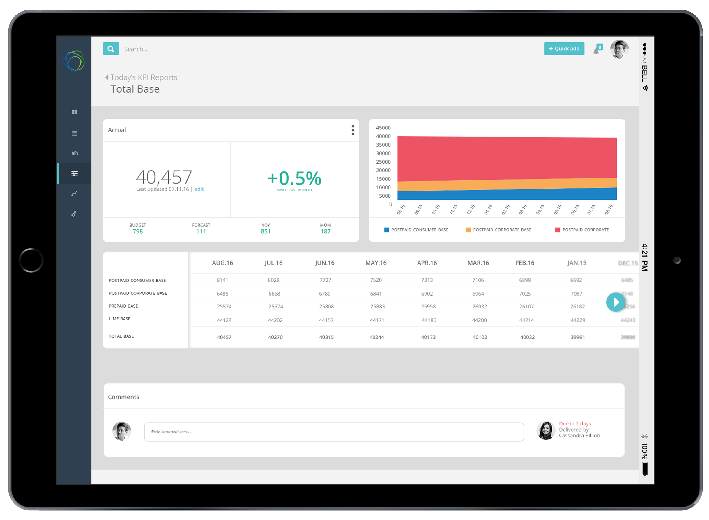
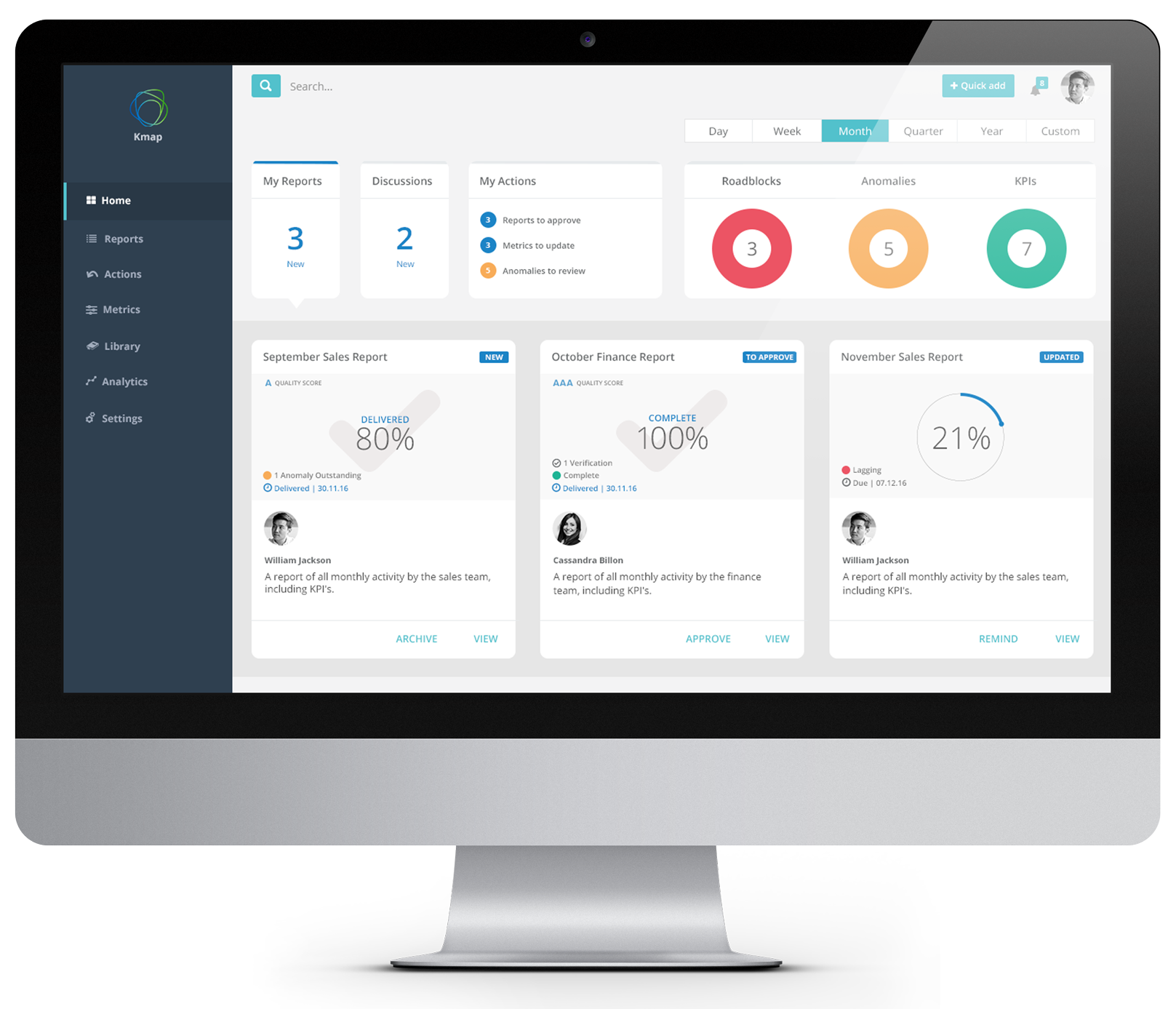
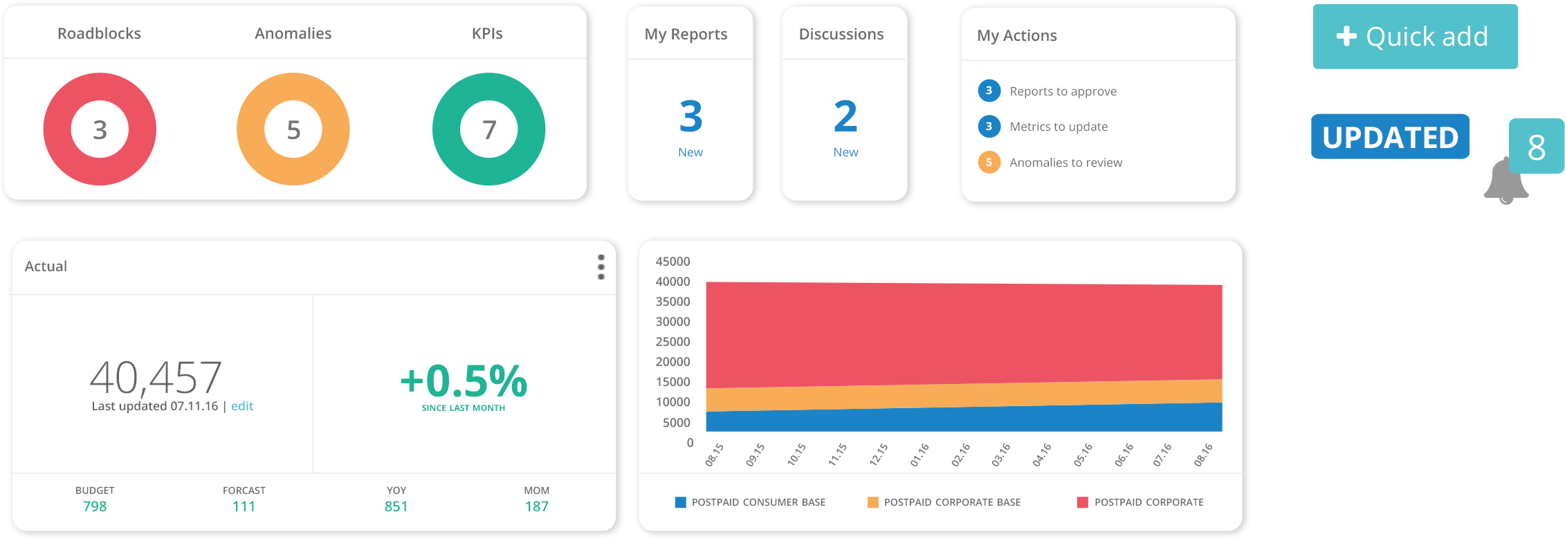
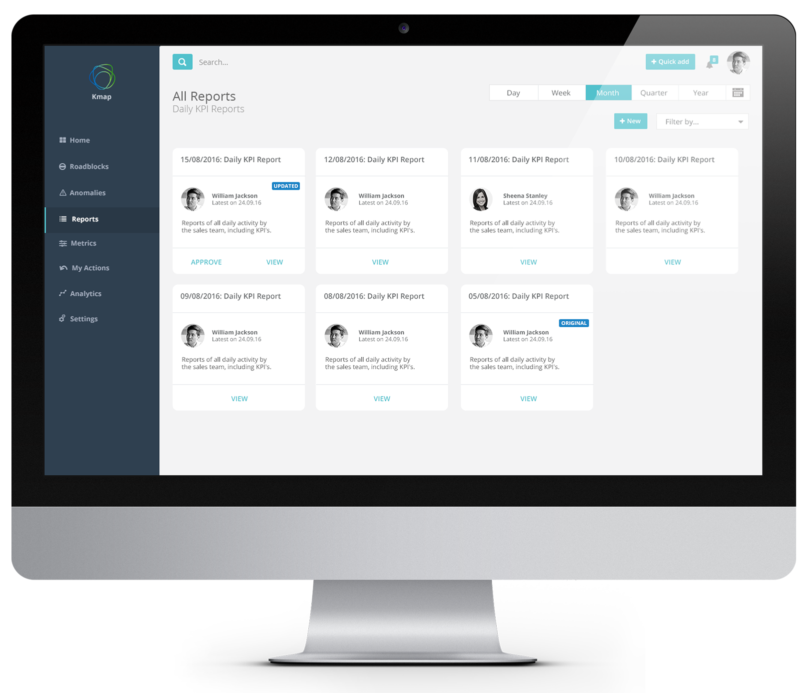
- Designed a simple and straightforward dashboard that provides quick access to all categories of data collection.
- Implemented labels, color categorization, and regular progress updates to enhance data visualization and user comprehension.
-
Design Elements
- Colors: Chose a professional color palette with a primary focus on blue and green tones for clarity and emphasis on important data. Used accent colors to highlight key metrics and status updates.
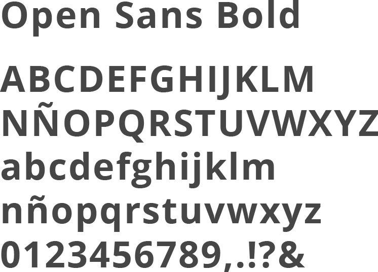
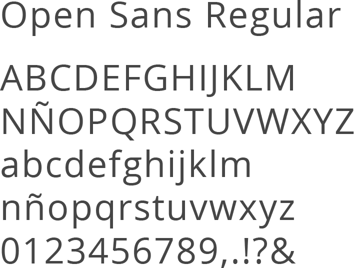
- Typefaces: Selected Open Sans due to its modern and clean appearance
Dashboard Components
Colour selection
Typeface selection
-
Interactive elements
- Incorporated interactive elements such as hover effects and clickable icons to enhance user engagement.
- Designed micro-interactions for actions like report approval, updates, and comments to provide immediate feedback and improve the user experience.
-
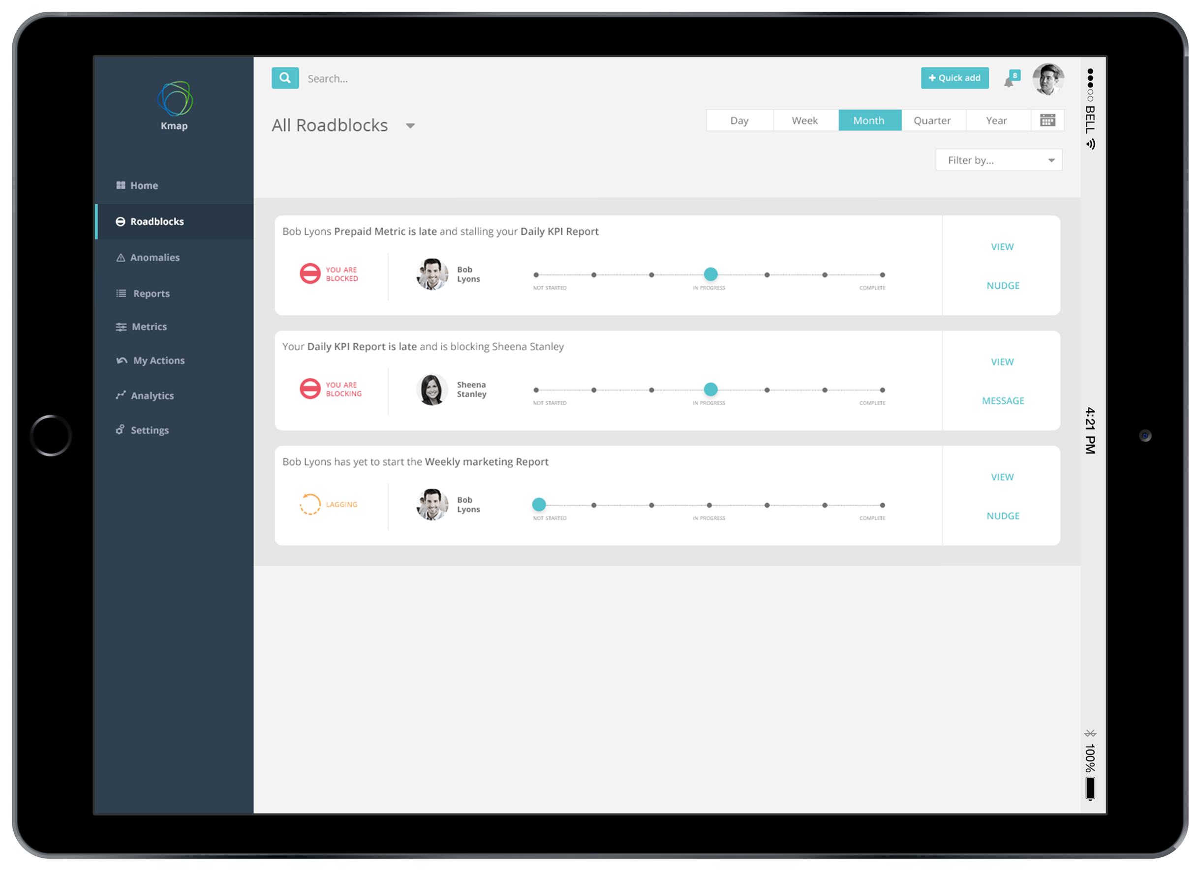
Reports and tracking
- Developed a system for tracking and managing reports with clear status indicators (e.g., delivered, complete, lagging).
- Included sections for roadblocks, anomalies, and KPIs to help users quickly identify and address issues.
-
Comments and collaboration
- Added a comments section to facilitate communication and collaboration among users.
- Enabled users to assign tasks and leave feedback directly within the dashboard.
Final Design: Testing, Validation, Impact & Results
The final design of the Kmap dashboard provides a streamlined user experience, enabling users to efficiently manage and track reports. The design ensures that users can easily access, visualize, and interact with critical data.
Testing and Validation
- Conducted extensive usability testing with representative users to gather feedback and refine the design. Iterated on the design to address any usability issues and improve overall user satisfaction.
Impact and Results
- The redesigned Kmap dashboard successfully improved the flow of critical knowledge and key data. The intuitive interface and interactive elements enhanced user engagement and satisfaction, leading to better data management and timely delivery of information.