Amethyst Air2024-2025
Amethyst Air is a concept airline. The purpose of this project was to create a well-researched and functional online booking system that gives users a frictionless process to purchase airline tickets using UX best practices.

- My Role
- Research
- UX
- Interaction Design
- Duration
- 6 months
- Project Type
- UX/UI
- Web Design
Background
Most airline companies offer users a confusing and overwhelming flight-booking process, generally offering one too many requests for the user to feel pressured into spending more money on their flight than necessary. Along with this, a lot of flight-booking websites are confusing, using company-specific jargon or not being explicit in what the actual cost of the trip is. By the time the actual flight is booked, the user can feel frustrated and exhausted.
Problem
Flight-booking can be cumbersome, overwhelming and difficult to interpret with completely different add-ons and confusing jargon between different companies. How can we make a flight-booking website that offers users a seamless and logical flow, where they have insight into exactly what they’re booking without having to struggle to understand how to buy a ticket.
Goals
The goal of this project was to create the ideal flight-booking experience by creating a website for a concept airline, Amethyst Air. Specifically addressing common painpoints found within existing airline interfaces and implementing the 10 core UX Heuristic principles.
Competitive Benchmarking
Competitive benchmarking is a tool used in UX research. We want to look at both apps and websites of competitors to understand what they’re doing that is working as well as to look at what they’re doing wrong and to learn from it.
It was important to keep the following questions in mind during the benchmarking process:
- What problems are these websites or apps solving?
- What are they doing well? Is there anything we can reproduce?
- What are they doing badly? What specific decisions can I make to do it better?
- Has there been established design conventions and patterns? Would the product benefit from following them?
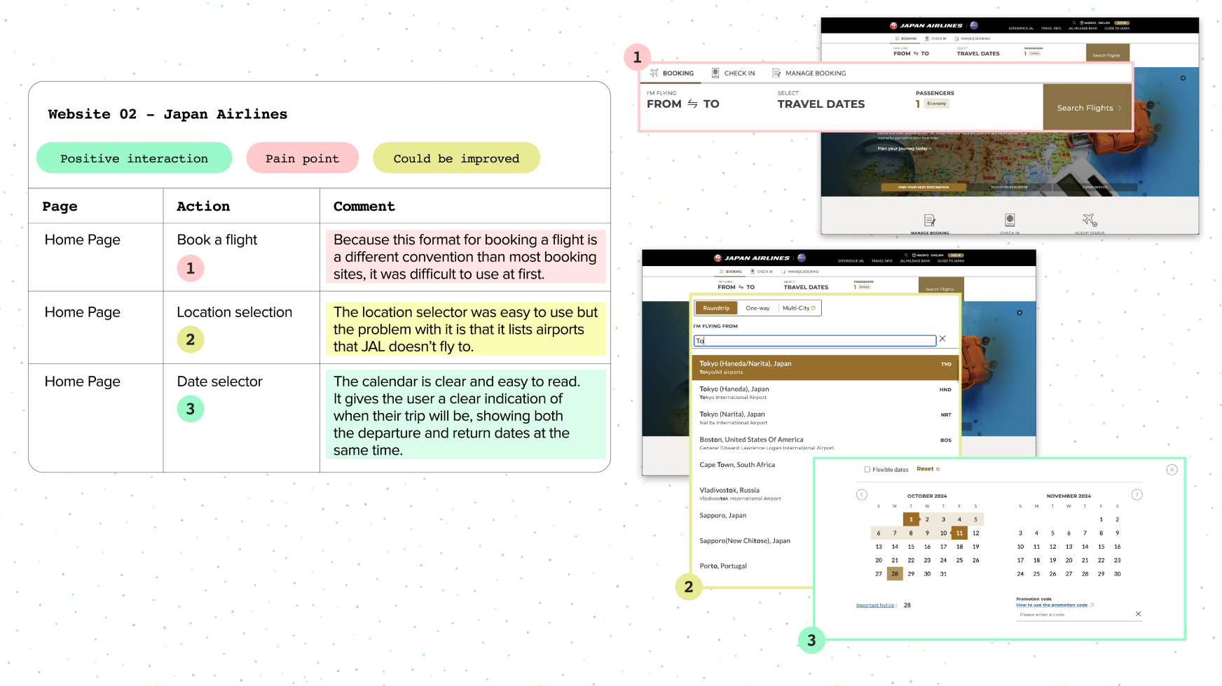
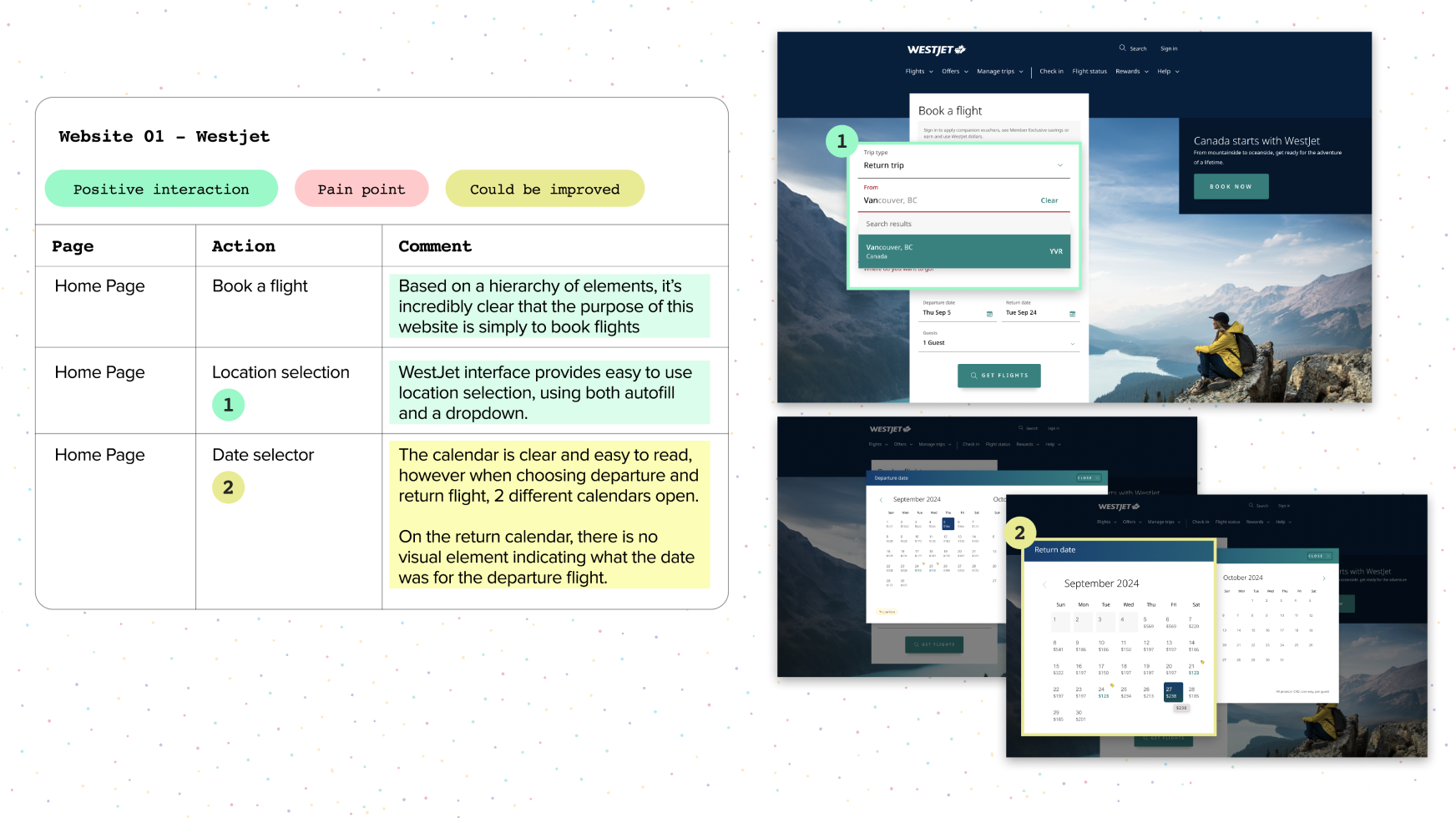
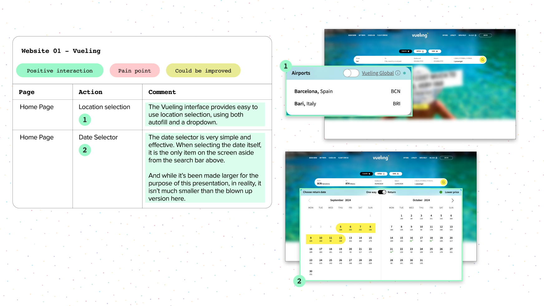
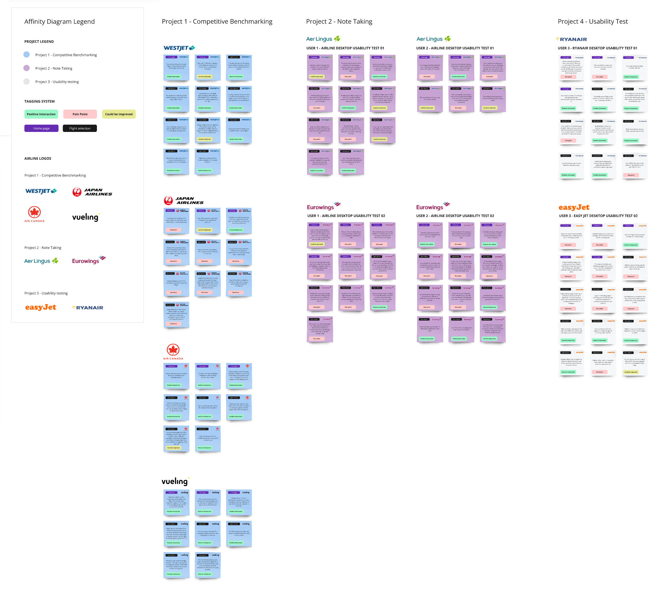
I began the process of Competitive Benchmarking using the 10 core usability heuristics created by Alan Cooper, Jakob Nielson and Steve Krug to evaluate the user experience between 4 different flight booking websites: WestJet, Air Canada, Japan Airlines and Vueling.
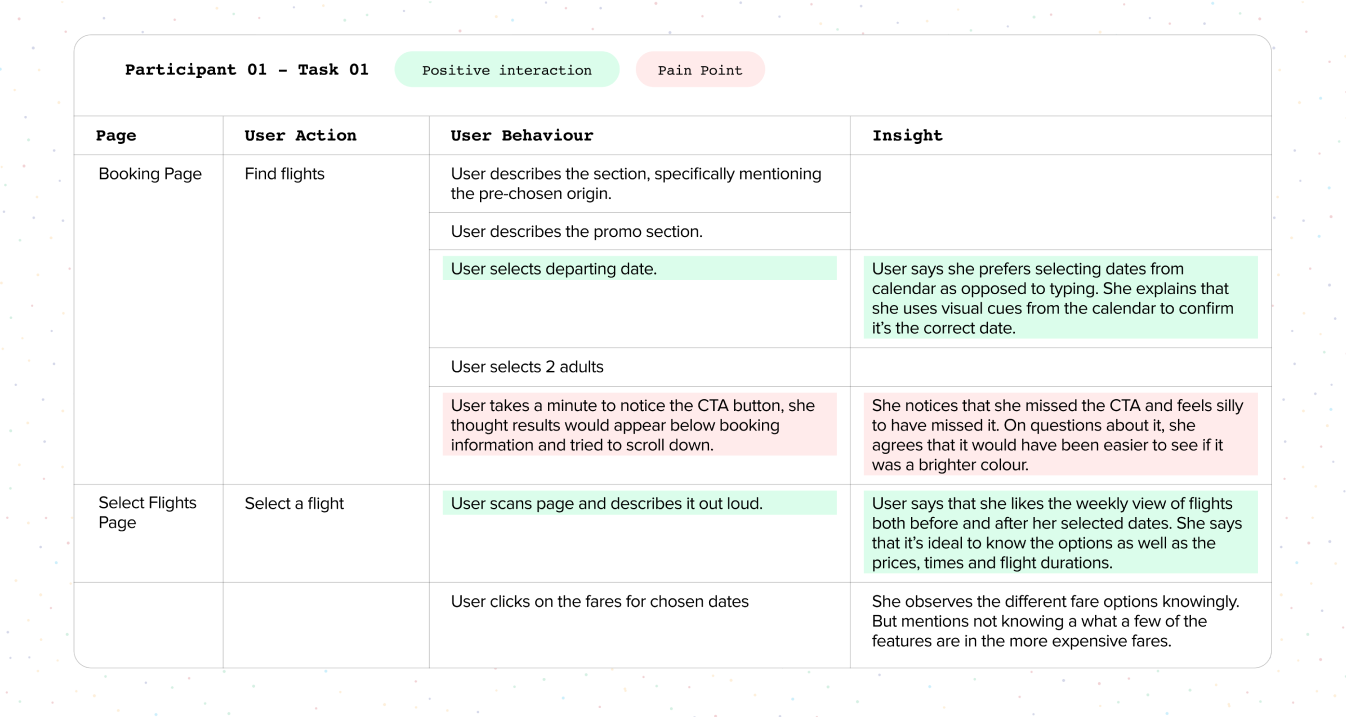
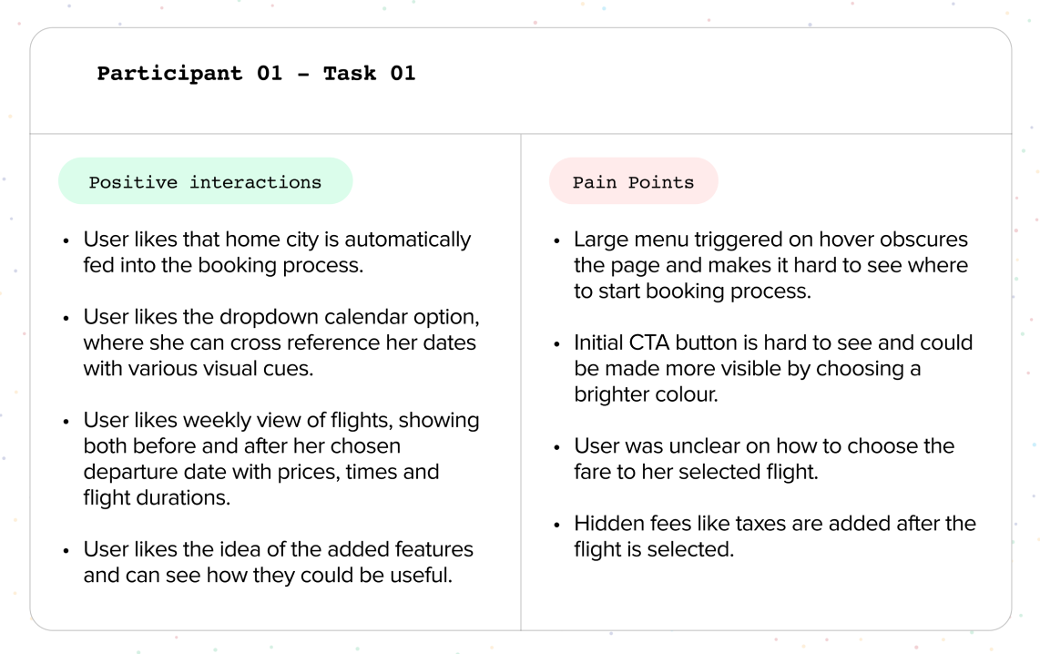
As I went through the process evaluating each website, I created documentation to highlight Positive Interactions, Pain Points and features that could be improved.
Usability testing & Note-taking
The purpose of note-taking is to extract the key information from a usability test or interview, this information is used to inform the next steps in the design process.
Usability testing is, in fact, the most powerful research tool as we can see how users take action in real time - 90% of communication is non-verbal, what people say they do and what people actually do are two very different things.
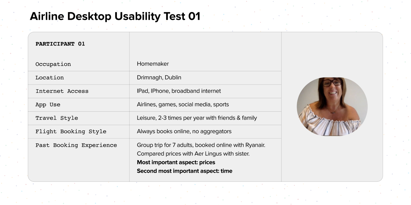
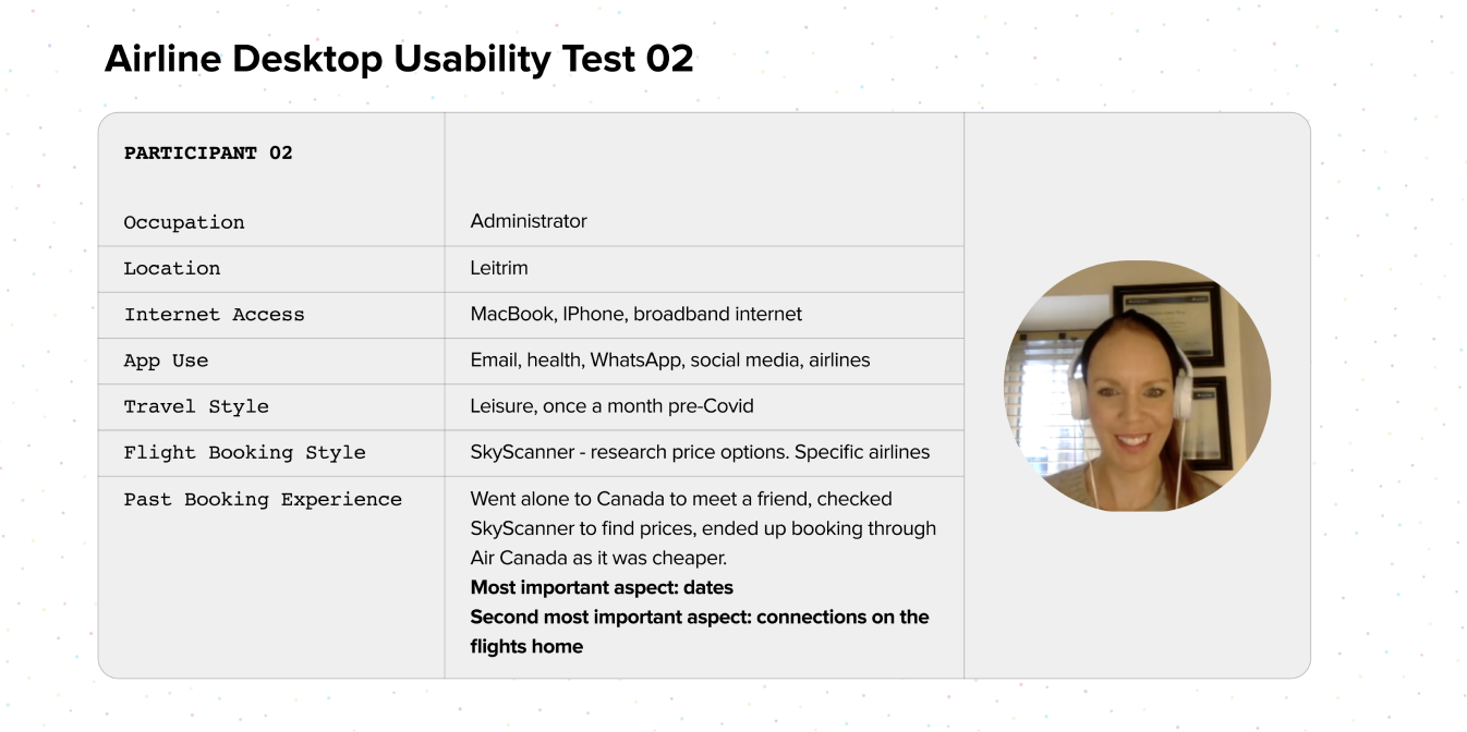
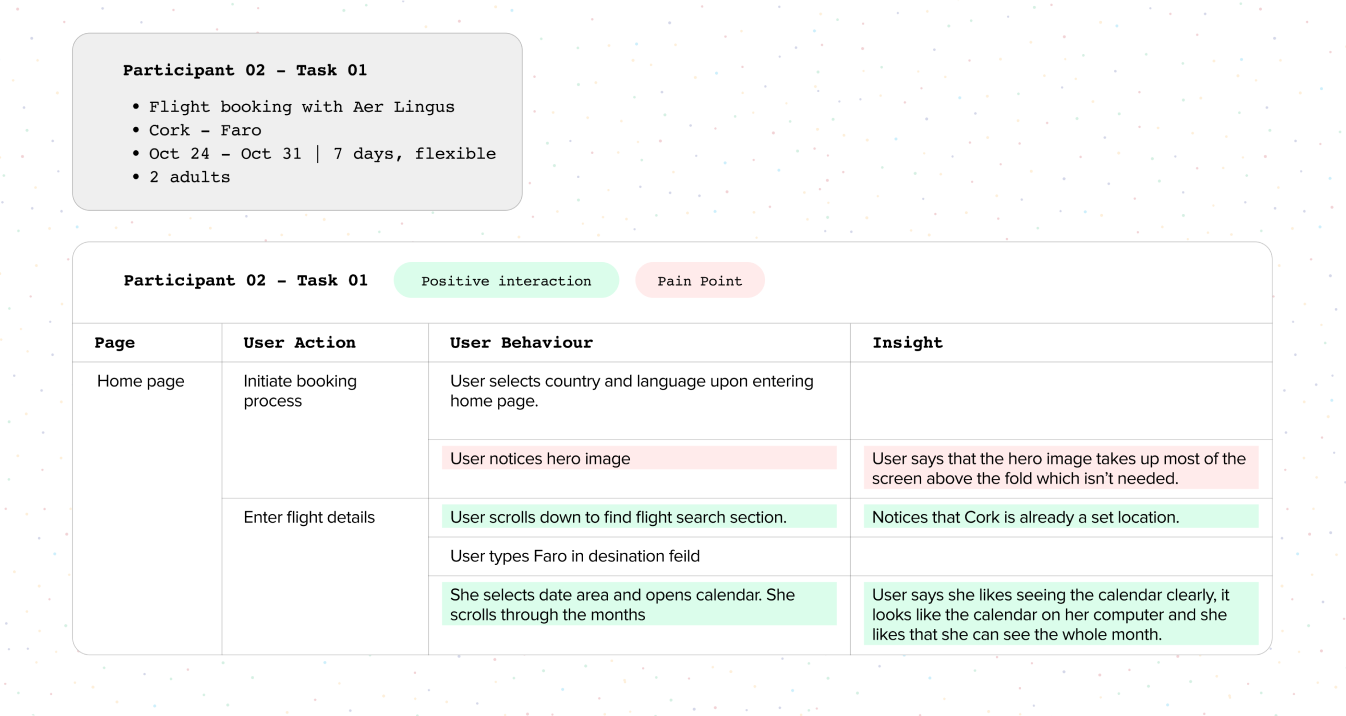
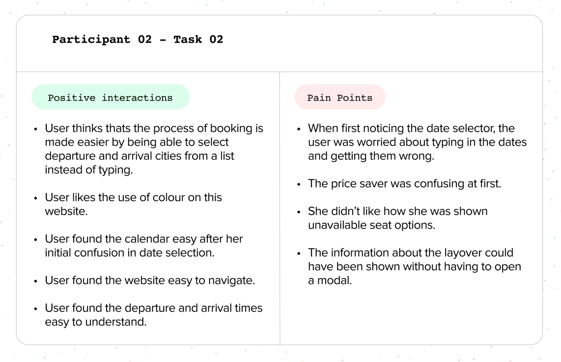
In order to get idea of what issues users are facing in real-world situations, I reviewed 2 previously recorded user tests which looked at AerLingus and Eurowings and followed up by conducting 2 more user tests that looked at RyanAir and EasyJet with a total of three participants.
Depth interviews were utilized where each participant had the opportunity to discuss their previous experiences booking flights. During this part of the interview, we looked at their pain points and struggles as well as positive experiences, along with their level of computer literacy, the frequency of their travel and how familiar they are with booking flights.
of communication
is non-verbal
- Flight price selection isn't always clear.
- Flight add-ons are often confusing and overwhelming.
- Familiar UI patterns are often deviated from creatiing confusion.
Affinity Diagram
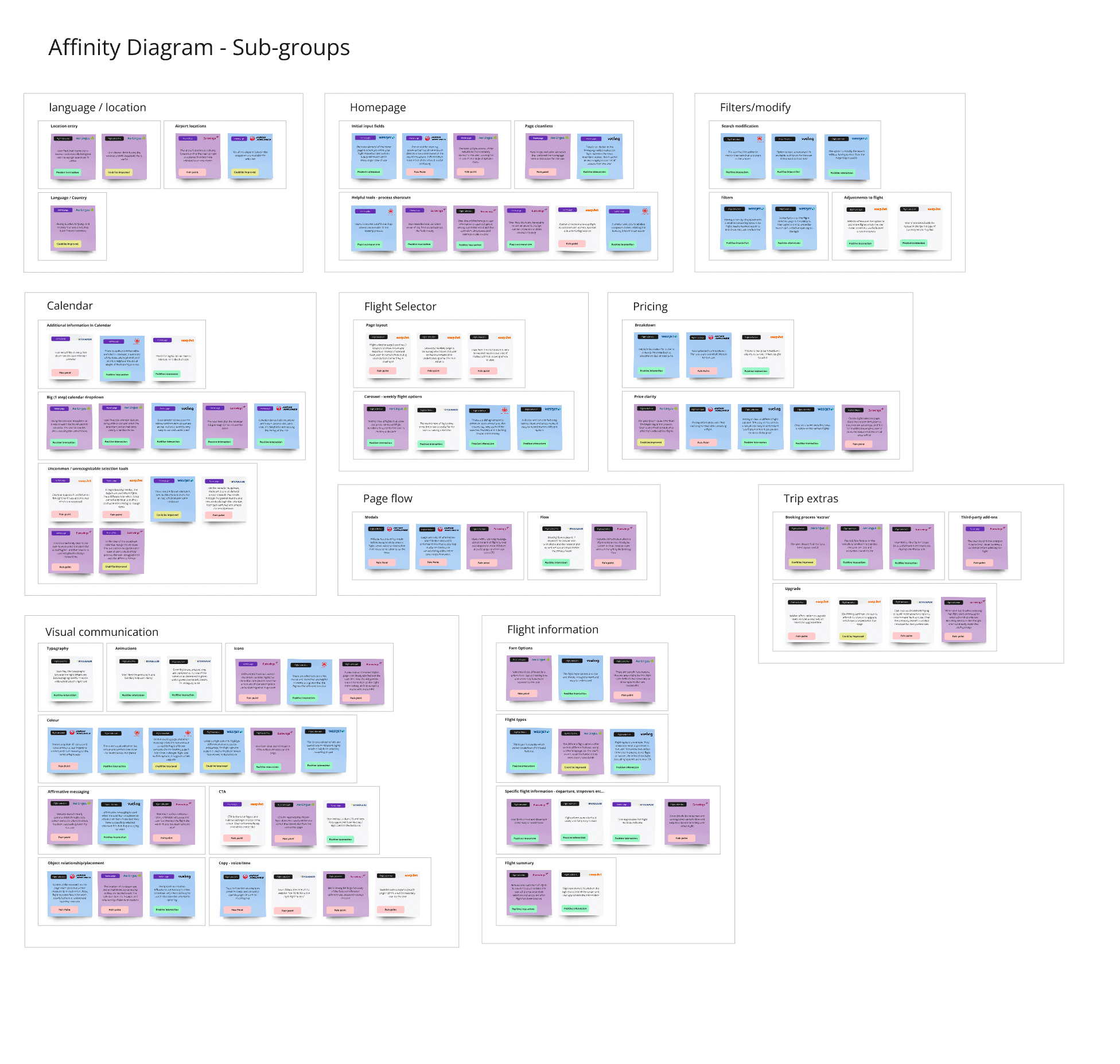
Affinity diagrams are by far the best tool to organize unstructured data. After completing research using several different methods, the time came to put all of that information together in logical groupings.
In my findings, the number one problems that users had were with the calendar, how to select a flight, pricing and having to pay for extra features.
- Both departure and arrival cities need to have clear labeling.
- The calendar picker needs to be simple and straightforward.
- Price needs to be clear as it's often the most important feature when booking a flight.
User Journey Map
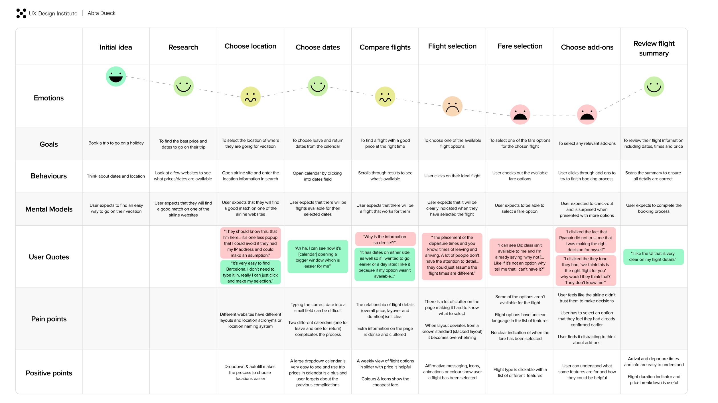
The User Journey map is an incredibly useful way to empathize with the user. Each step of the journey highlights the user’s goals, their behaviour and their pain points as well as positive interactions.
This is a really specific way to drill down into exactly what needs to be done to create the ideal user experience when creating a booking flow for my website.
- Users found densely laid out information hard to understand.
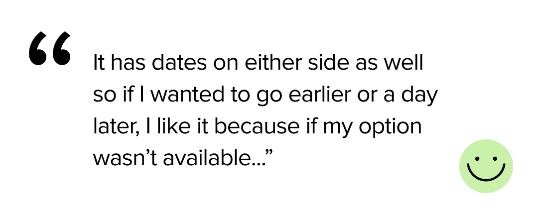
- Users liked the scrolling calendar option in flight selection that showed different dates and price options.
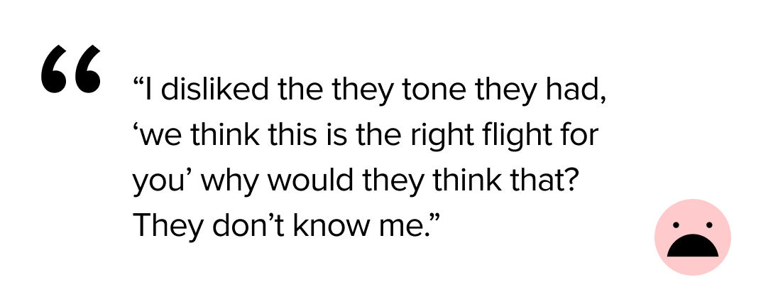
- Users did not like having extra features with extra cost pushed on them.
Flow Diagram
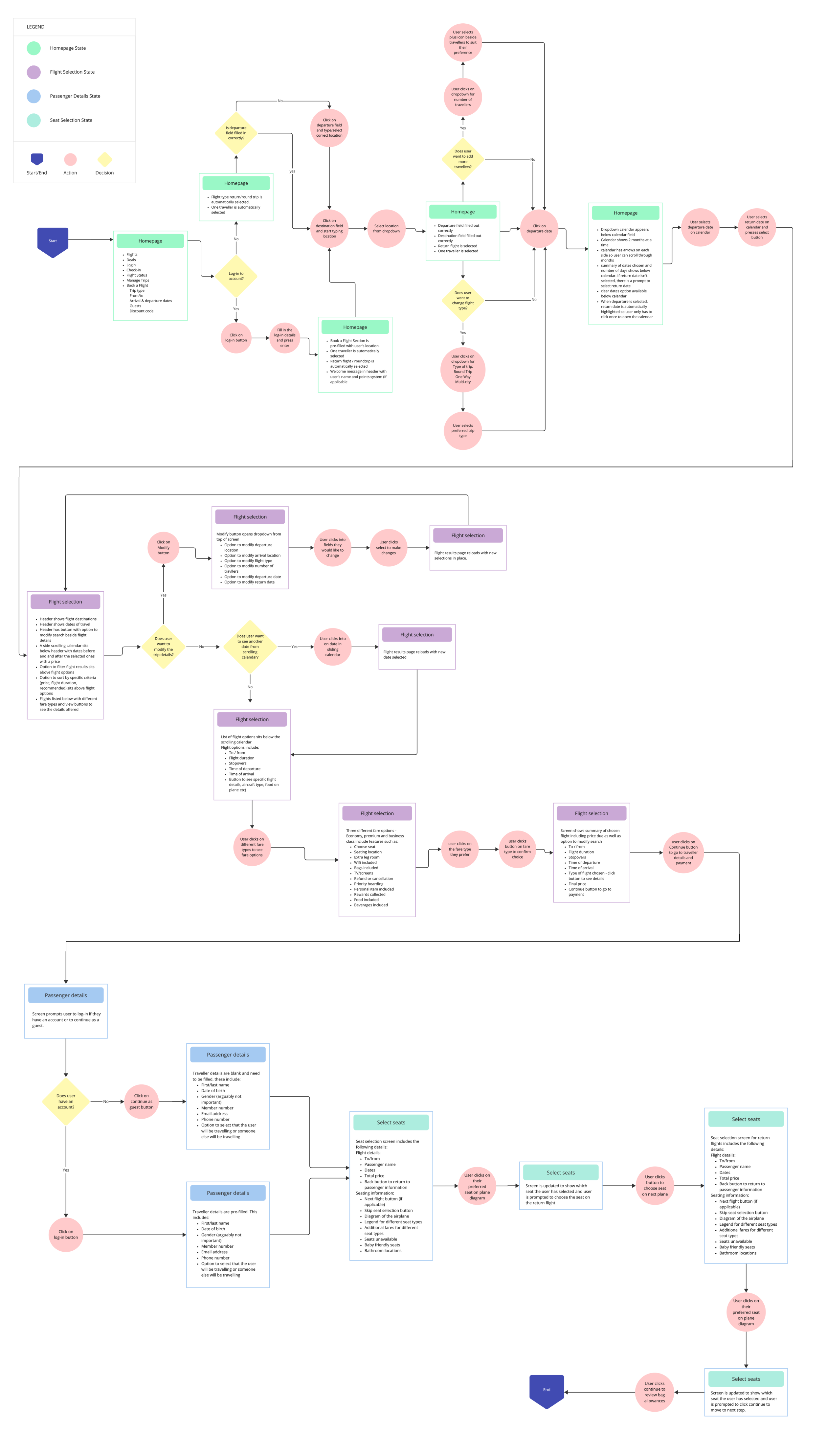
After completing the research stage of the process, it was time to start on design. The first step in this process is in creating a flow diagram, following the user path through the website from the initial homepage to flight selection to check-out to seat selection.
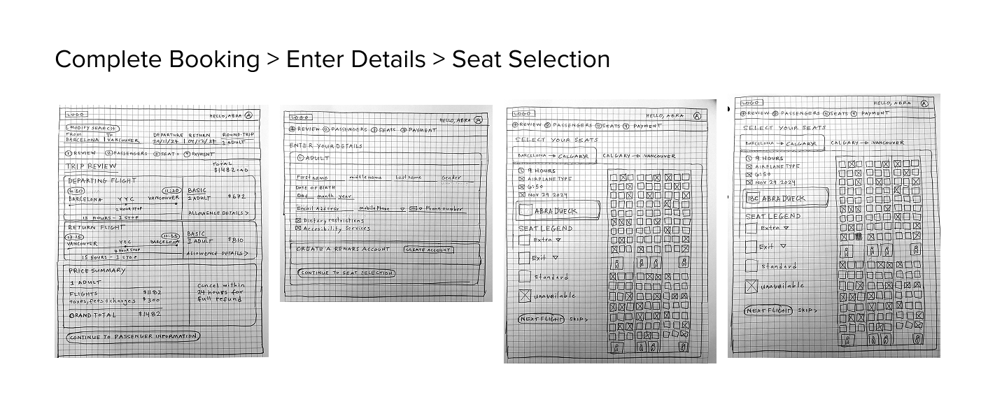
Interaction Design Sketches
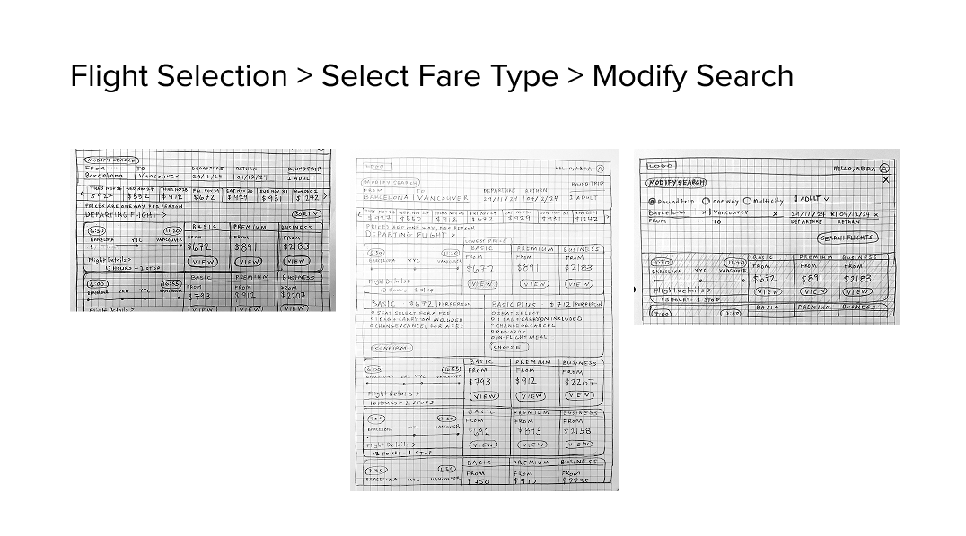
Finally time to take pen to paper and figure out not only how the design will generally look but also to implement all of the research findings up until this point into the final few steps of the process.
Keeping in mind the user goals, behaviour and paintpoints, the sketches were designed to keep the user flow simple and effective. minimizing unnecessary details that clutter the user journey and cause friction.

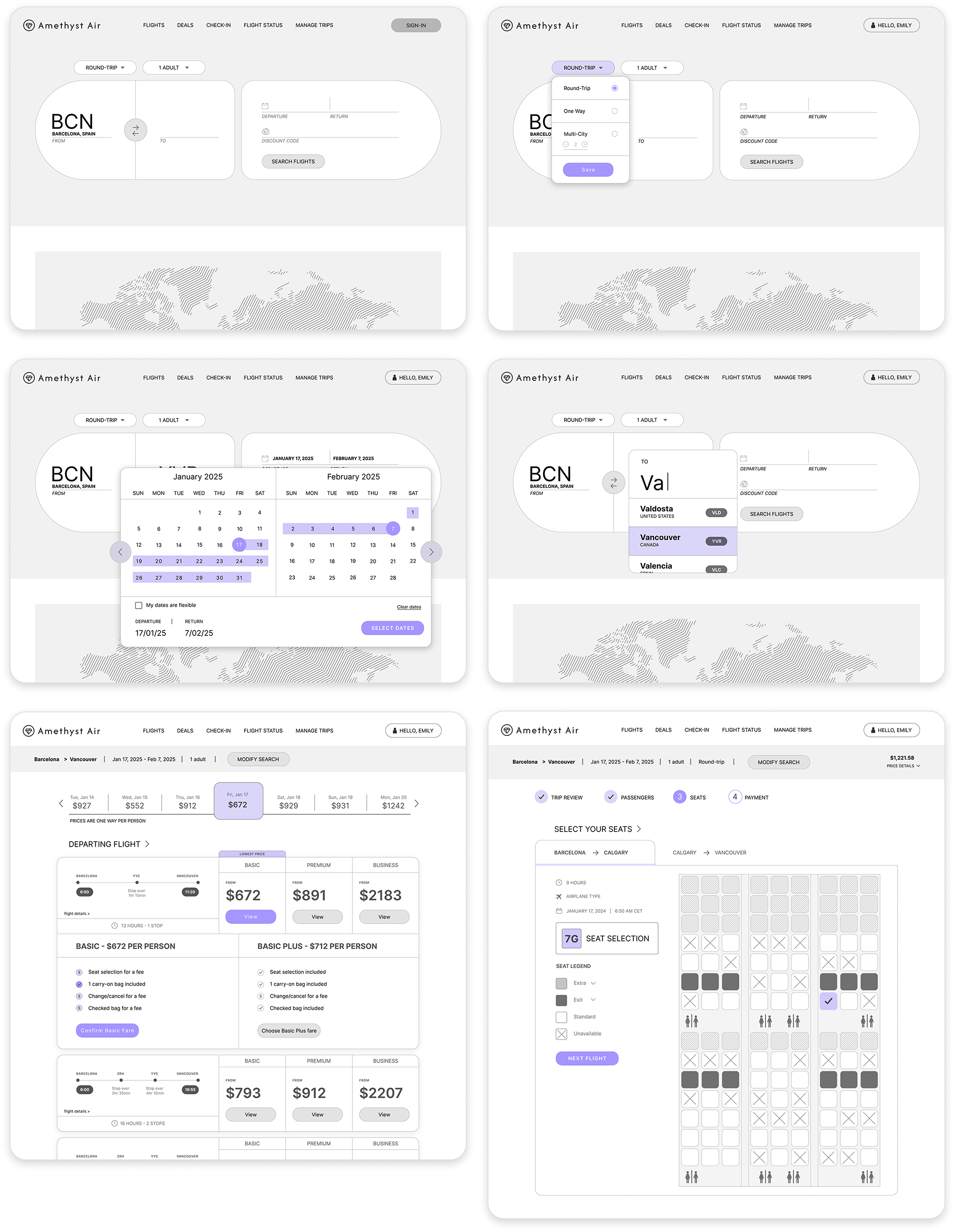
Wireframing & Medium Fidelity Prototyping
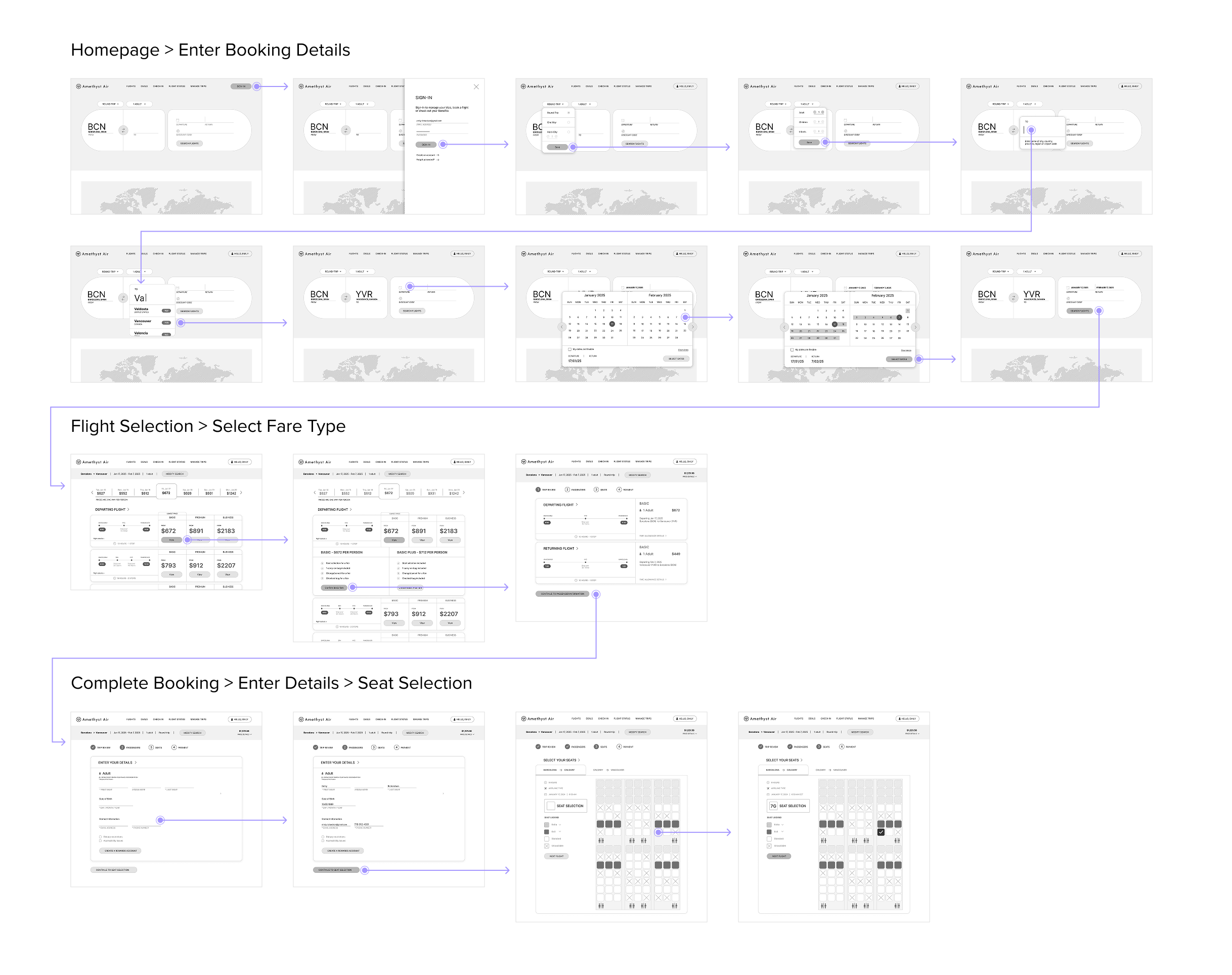
Once the key interactions had been discovered, the next step would be in making the wireframes, and turning that into a medium fidelity prototype to nail down the key interactions before the final stage of annotating the designs for hand-off.
See Prototype