Actua B2016
Branding proposal for Actua B, an architectural firm based in Barcelona.
This proposal includes a logo redesign, focusing on colour application as well as clean and modern typography. Responsive web design and general store branding. This classic style is elegant and minimalistic and uses two contrasting typefaces to reflect the sentiment: “Ser profesionales y ser poetas”
- Project Type
- Digital
- Branding
- Concept
- Signage
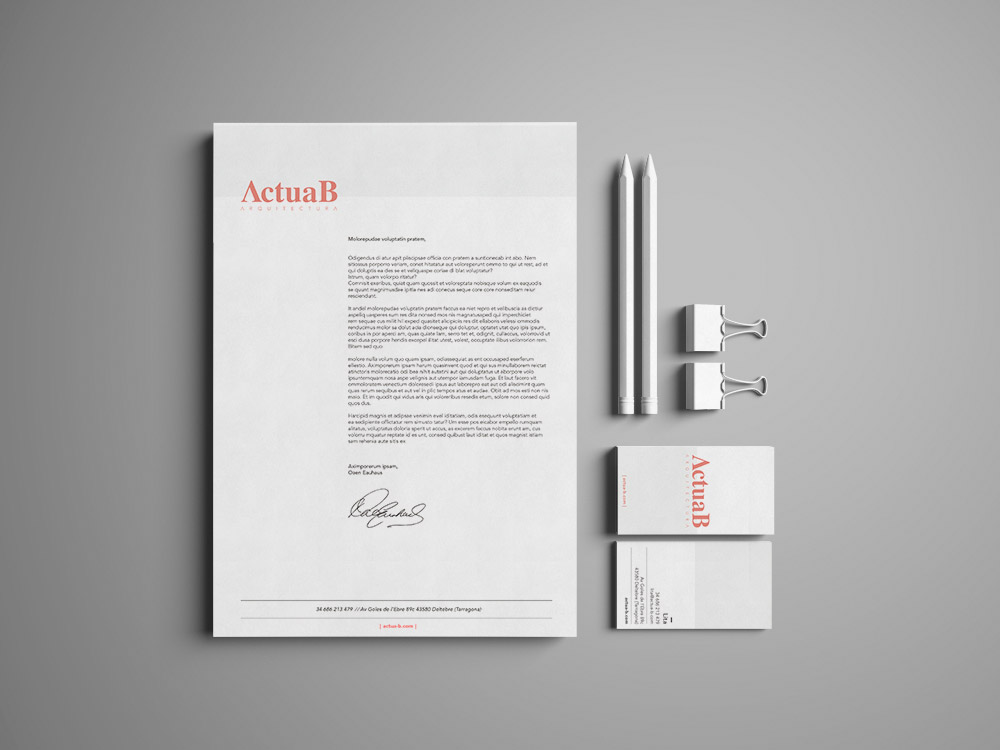
- Stationary
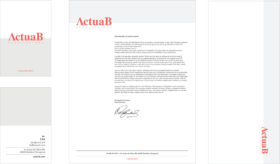
Branding
Colour selection
Typeface selection
Logo Design
Contrasting Typography
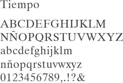
Tiempo is a serif typeface from the Transitional era which represents the initial departure from centuries of Old Style type and immediately predate the Modern period. It is structurally sound with elegant curves and contrasting weights.
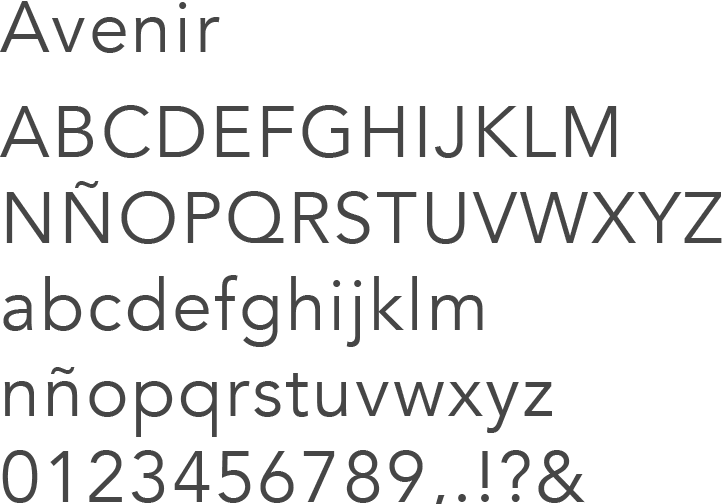
In contrast, Avenir is a proportional sans-serif typeface with a humanized touch designed by Adrian Frutiger in 1988. The typeface is simultaneously geometric and organic with simple with straight and even lines, rendering it modern and clean.
Stationary
Web Design
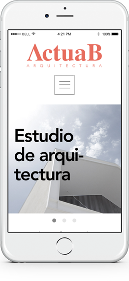
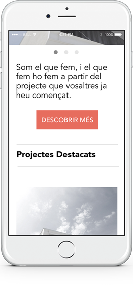
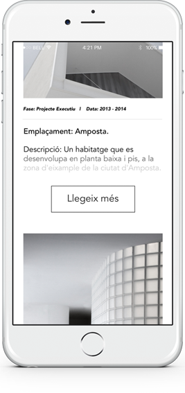
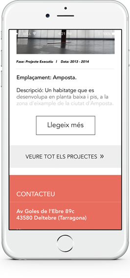
A mobile-first design approach for the web presence of Actua B was implemented to ensure the Architecture agency’s brand was reflected in the most efficient, modern way.
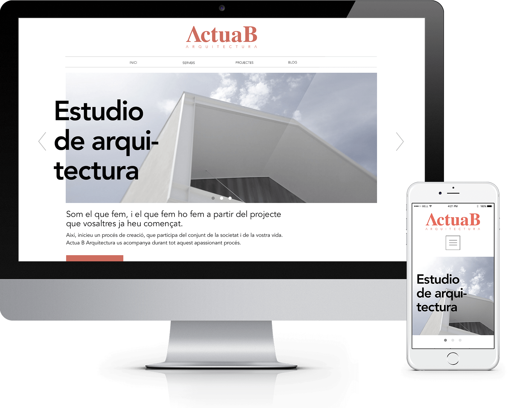
Mobile Design
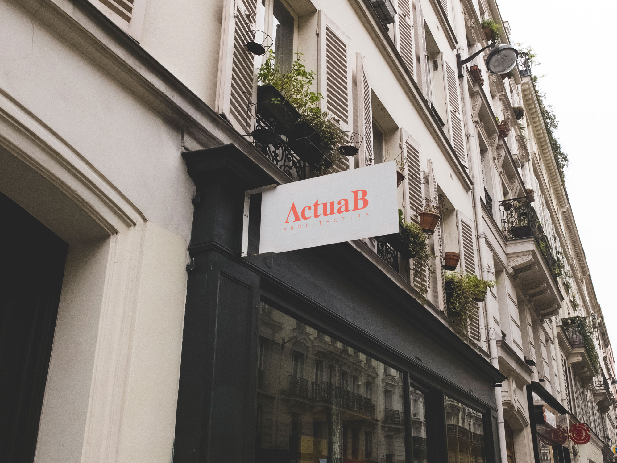
Signage
No company is complete without a sign. A simple yet elegant signage solution was created to give the company brand its finishing touch.