Upshelf Design System2022-2024
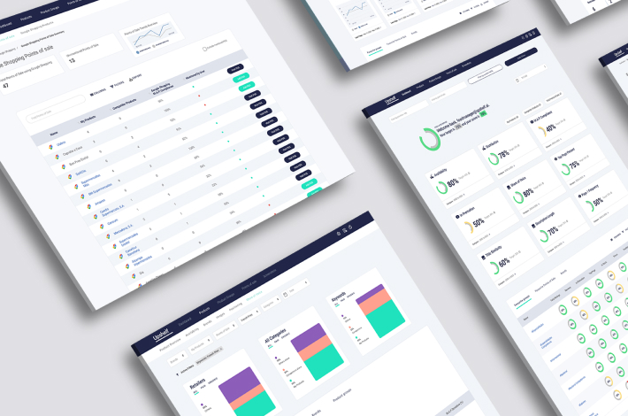
Upshelf helps users master their digital shelf with powerful and intuitive analytics. By leveraging AI, Upshelf enables users to see the big picture, pinpoint granular details, and unlock AI-powered insights to guide actions, streamline workflow, and maximize impact.
- Project Type
- Research
- UX
- UI
Problem Statement
The existing design system lacked consistency and contained numerous errors, leading to a disjointed user experience and inefficiencies in the design and development processes. The challenge was to create a unified, easy-to-use design system that would support the company’s goals and enhance the overall user experience.
Project Overview
As a UX/UI designer, I undertook the task of overhauling and improving the company’s existing design system. The original design system was plagued with inconsistencies and errors, making it difficult for the design and development teams to maintain a cohesive user experience. My goal was to streamline the design system, ensuring consistency, accuracy, and usability across all products.
Research & Audit
- I conducted a thorough audit of the existing design system to identify inconsistencies, errors, and areas for improvement.
- Interviewed key stakeholders, including designers, developers, and product managers, to gather insights on the pain points and requirements for the new design system.
- Analyzed competitor design systems and industry best practices to benchmark and draw inspiration.
Component Library
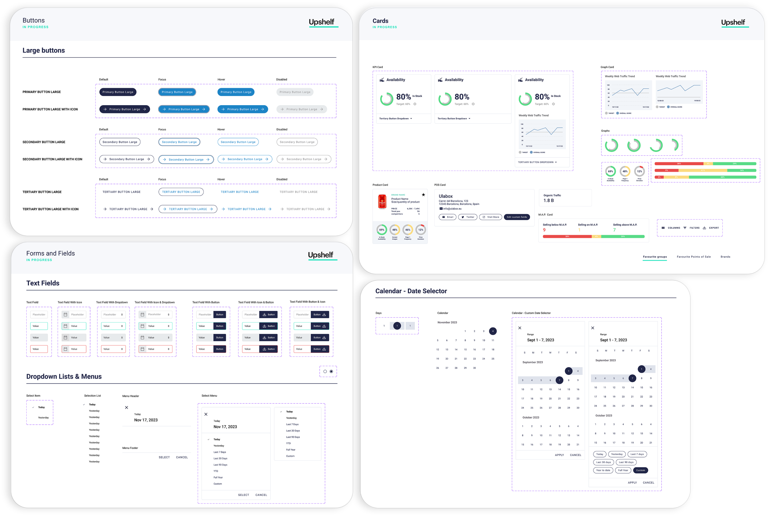
- Created a comprehensive component library, including buttons, forms, navigation elements, modals, and more.
- Standardized component usage with clear guidelines and documentation to ensure consistency across all products.
- Ensured components were responsive and accessible, adhering to WCAG guidelines.
- Defined clear design principles that guided the overhaul process, ensuring that the new design system was user-centric, scalable, and consistent.
- Focused on principles such as simplicity, consistency, accessibility, and flexibility.
Typography and Color Palette
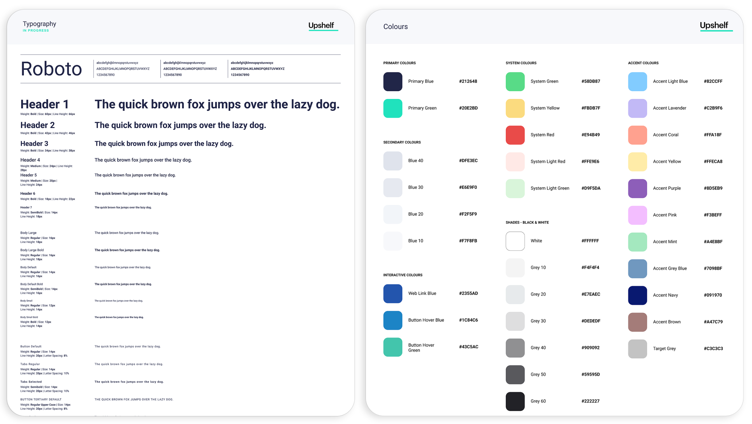
- Refined the typography system, establishing a clear hierarchy and selecting typefaces that enhance readability and aesthetics.
- Developed a cohesive colour palette, defining primary, secondary, and tertiary colours, as well as usage guidelines for text, backgrounds, and interactive elements.
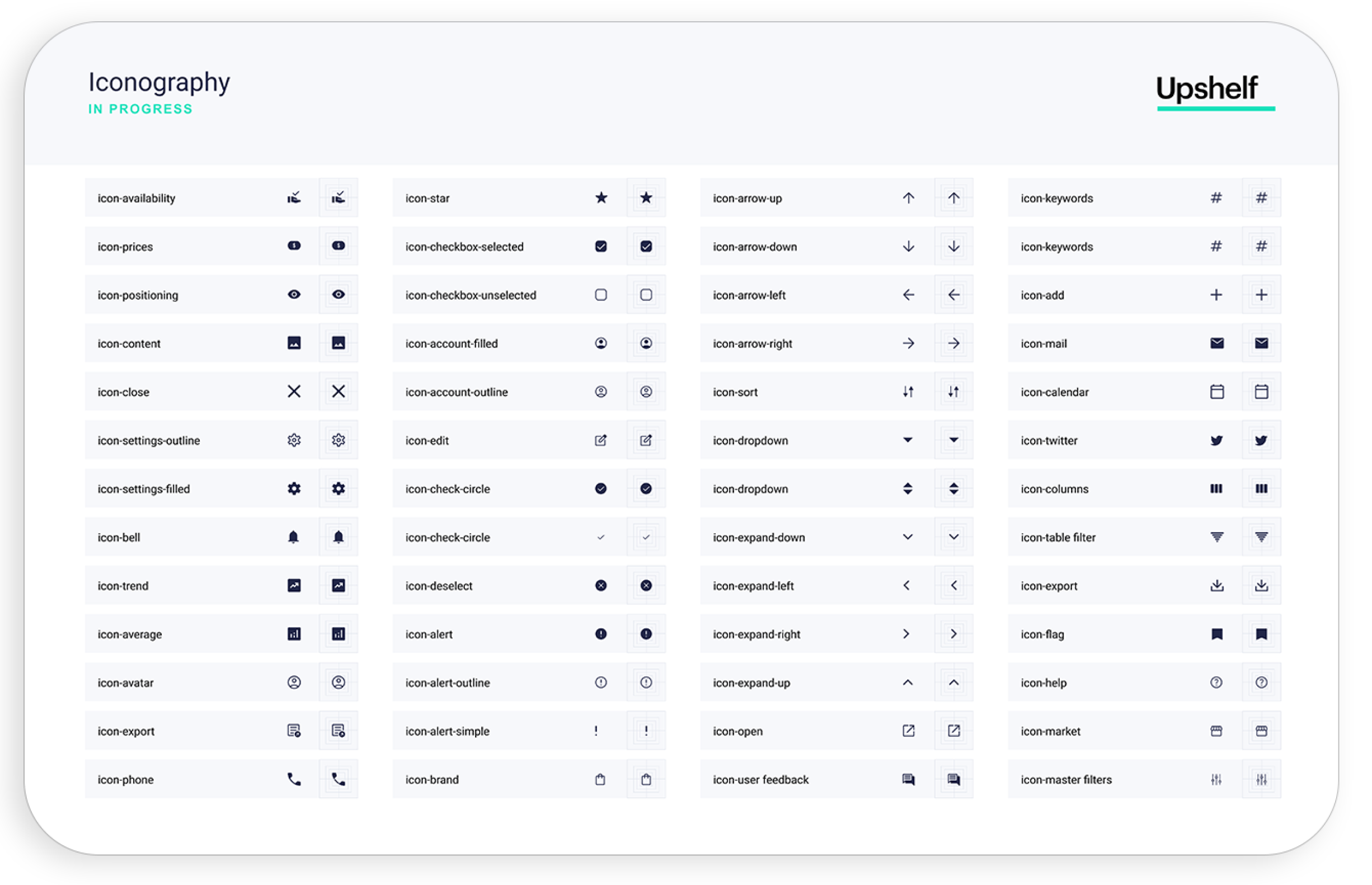
Iconography
- Designed a set of custom icons that align with the company’s brand identity.
- Standardized icon usage and created guidelines to ensure consistency in size, style, and placement.
Tools for Consistency
-
Spacing and layout
- Defined a consistent spacing and layout system, including grids, margins, and padding.
- Created guidelines for responsive design to ensure a seamless experience across different devices and screen sizes.
-
Interactive elements and states
- Standardized interactive elements such as buttons, links, and form fields, and defined their various states (e.g., hover, active, disabled).
- Ensured that interactive elements provided clear feedback to users, enhancing usability.
-
Documentation and guidelines
- Developed comprehensive documentation for the design system, including usage guidelines, do’s and don’ts, and best practices.
- Created a centralized repository for the design system, making it easily accessible to designers and developers.
-
Collaboration and iteration
- Collaborated closely with designers, developers, and stakeholders to ensure alignment and gather feedback throughout the process.
- Iterated on the design system based on user testing and feedback, continuously improving and refining the components and guidelines.
Impact & Results
The new design system significantly improved consistency and accuracy across all products, leading to a more cohesive and polished user experience. Streamlined design reduced time and effort required to create and maintain interfaces. Enhanced collaboration between designers and developers, resulting in better alignment and more efficient workflows. Improved accessibility and usability, making the products more inclusive and user-friendly.

